How to Design a Bathroom with Character — A London Interior Designer's Guide (2026)
- Apr 29
- 12 min read
Tile layouts, hardware finishes, palette families and the quieter details that separate a bathroom that functions from one that stays with you.
The bathroom is one of the most exacting rooms in a home. Every finish is seen up close. Every decision carries weight. Which is precisely why, when it’s done well, it becomes the space people remember most.
I’ve worked on bathrooms across London - from Georgian flats in Islington to lateral apartments overlooking Hyde Park. While each brief is different, the principles remain consistent. What follows is a considered approach to layout, tile, palette, material, and the quieter details that shape how a bathroom ultimately feels. This is the approach I bring to bathroom projects across London - from Chelsea and Kensington to Islington and beyond.
Tile Layouts
The layout of a tile is as important as the tile itself. The same format can read as entirely different spaces depending on how it’s set. Below are some of the layouts I return to most often, and how they tend to influence a room.

C L A S S I C
Brick Bond | Running
Timeless and forgiving. Works across most tile formats. The 50% offset reads as effortless - a familiar choice that holds up well over time, which is precisely its value in a room designed to last.

A R C H I T E C T U R A L
Stacked | Grid Bond
The vertical grout lines align, creating a clean, graphic quality. Particularly effective with larger formats or slabs. It lends a more architectural feel - structured, intentional, and quietly confident.

C H A R A C T E R
Herringbone
Directional and warm. Best suited to smaller formats - metro or narrow tiles. On a floor, it draws the eye inward; on a wall, it introduces movement without relying on pattern.

G R A P H I C
Chequerboard
High contrast and expressive. Works well on floors or as a defined wall treatment. Using natural stone softens the effect, allowing variation in tone to break up repetition.
P R O P O R T I O N A L
Vertical Stack
A useful approach for lower ceilings. The vertical orientation draws the eye upward, subtly altering the perceived proportions of the space.

S C U L P T U R A L
Large Format | Slab
Minimal grout lines, maximum material presence. Larger formats read almost as continuous surfaces. Best suited to more pared-back schemes where the material itself carries the space.

D I R E C T I O N A L
Chevron
More precise than herringbone. The tiles meet at a clean point, creating a sharper and more controlled line. It reads tailored and considered - introducing movement while maintaining a sense of order.

H E R I T A G E
Basket Weave
A pattern with a long history, often seen in stone mosaics. It introduces rhythm without feeling overtly decorative. Smaller scales keep it refined, making it particularly suited to more classic or quietly architectural spaces.
"The bathroom is the most honest room in a home. There is nowhere to hide. Which is precisely why, when it works, it becomes the room that stays with you longest."
Grout
Grout is not a neutral decision. It is a design decision. And it is one of the most common places I see an otherwise resolved bathroom fall apart.

Matched Grout
Match your grout to your tile and it disappears - the room reads as a continuous surface, clean and calm.

Mid Tone Grout
Warm stone or grey grout that sits within the tile's own tonal range. Reads the same as a near-match at first glance but holds its colour for longer than white.

Contrasting Grout
A contrasting grout introduces a grid, turning the layout into a more visible feature.
A few specifics: white grout yellows. Epoxy grout is more expensive and more resistant; worth it in shower enclosures and anywhere steam is constant.
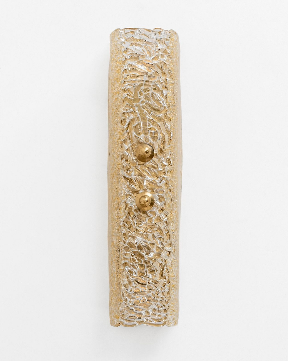
Hardware Finishes — Getting the Metal Right
The hardware finish sets the temperature of the entire room. It connects the tile to the fittings, the fittings to the accessories. Get it right, and everything reads as a single thought. Get it wrong - or don't think about it at all - and the room feels assembled from separate shopping trips.

M Y G O - T O
Aged / Antique Brass
Pre-patinated finish. More consistent than unlacquered, less cold than brushed. Good for clients who want warmth without variability. Works particularly well in period properties.

M Y G O - T O
Unlacquered Brass
My most-used specification. It patinas naturally - growing darker, richer, more complex over time. Each bathroom develops its own tone. The imperfection is the point.

M Y G O - T O
Brushed Brass
Warmer than brushed nickel, more restrained than unlacquered. The matte, directional surface diffuses light rather than reflecting it - it reads as part of the room rather than a focal point within it. For clients who want the warmth of brass without the variability of an unlacquered finish, this is the answer.

A R C H I T E C T U R A L
Chrome
The sharpest finish in the range. Where brass warms a room, chrome clarifies it - reflective, precise, and quietly architectural. Best suited to a pared-back scheme with strong stone or a cooler palette, where the goal is definition rather than warmth.

H E R I T A G E
Brushed Nickel
Cooler in tone and more restrained. Doesn't compete with stone or marble. A good neutral choice when you want the material, not the metal, to carry the room.

C O N T E M P O R A R Y
Matt Black
Popular and widely available, but less practical than it appears. Limescale shows immediately on dark surfaces, requiring constant upkeep in hard-water areas. The stark contrast against white or light tiles can feel heavy-handed rather than intentional. Better suited to darker schemes.
My own preference is aged / antique and unlacquered brass. I return to them more than anything else. But it's far from the only answer, and understanding why each finish works is more useful than defaulting to one.
The Palette Families I Specify Often
W A R M N E U T R A L S W I T H A G E D B R A S S

The most liveable palette I return to. Works across bathroom sizes. The aged brass reads warm and natural - it doesn't compete with the stone or the timber, it complements them.
D E E P T O N E W I T H U N L A C Q U E R E D B R A S S

For bathrooms with a strong point of view. The deep field colour - emerald, oxblood, ink navy - provides the drama. Unlacquered brass softens it. Cream accessories and natural linen prevent it from tipping into cold or masculine.
S T O N E A N D M I C R O C E M E N T — S E A M L E S S A N D S C U L P T U R A L

The quietest palette of the three. The goal is material continuity - floor to wall, wall to ceiling - with almost no visual interruption. Textures are everything here: the slight roughness of microcement against the cool smoothness of a stone basin. Fittings should be understated: matte bronze or raw iron.
The Shower Curtain — Reconsidered
The shower curtain has a reputation problem. It sits at the bottom of the bathroom hierarchy, beneath the frameless glass screen, beneath the bespoke enclosure, beneath almost every decision a designer is expected to make. I want to push back on that.
A shower curtain is one of the few soft elements in a bathroom. In a room that is otherwise entirely hard, stone, glass, ceramic, metal, fabric introduces something the rest of the space cannot: movement, warmth, a quality that changes with the light. A well-chosen curtain does more for the atmosphere of a bathroom than most hardware decisions.
The practical case
A curtain is easier to install than a glass screen and significantly cheaper to replace. It conceals the shower zone without requiring a door, useful in smaller bathrooms where a swinging or sliding door creates an awkward interaction with the basin or towel rail. It is also the one element in the bathroom you can change completely for under £100, which gives it a flexibility no fixed screen can match.
The practical requirements are straightforward: the curtain must be long enough to reach the floor or sit just above it. A curtain that stops mid-calf looks unfinished. The rail should be solid, properly fixed, and proportioned to the space. A flimsy tension rod in a well-specified bathroom undermines everything around it.
The aesthetic case
Linen is the material that works hardest here. It drapes well, dries quickly enough for bathroom use when the room has adequate ventilation, and ages beautifully, softening and relaxing over time rather than looking worn. An undyed or stone-washed linen curtain in a warm off-white or natural flax tone brings the same material quality to the shower zone that a good textile brings to any other room.
Pattern is possible, but demands the same restraint as any other pattern decision in a bathroom. One strong pattern in a small room is usually enough. A narrow stripe, a classic ticking or a simple two-tone woven, reads as intentional rather than decorative.
The rail
The rail matters as much as the curtain itself, and there are two configurations worth considering seriously.
A ceiling-mounted rod, fixed directly to the ceiling rather than wall to wall, gives the shower zone a sense of height and permanence that a standard bar never achieves. The curtain drops from ceiling to floor, framing the space like a room within a room. In unlacquered brass, brushed nickel, chrome or matte black, it reads as a deliberate architectural element rather than a practical afterthought. The finish should be chosen to match or complement the tapware already in the room.
The oval rail around a freestanding bath is a different proposition entirely, and one of my favourite details in a bathroom. Rather than enclosing a shower zone, it traces the perimeter of the bath, allowing a curtain to be drawn fully around it when in use and pushed back to the sides when not. The oval form echoes the bath beneath it. It introduces a canopy quality, a sense of enclosure and privacy that a glass screen could never give. In a room with a freestanding bath, this is almost always more interesting than any fixed screen alternative.

Lighting — The Most Overlooked Decision in a Bathroom
Most bathrooms are lit badly. A single ceiling downlight, positioned wherever the builder found it easiest to run the cable, casting a flat overhead wash across a room designed to be seen up close. It makes the tile look wrong. It makes faces look worse. And because it is infrastructure rather than a visible product, it gets no attention during the design process.
A well-lit bathroom uses three layers, each doing something different.
Not all three need to be in every bathroom - but understanding what each one does makes the difference between a space that works at 7 am and one that looks like a hotel corridor.
A M B I E N T
The background light. Usually a ceiling downlight or recessed fitting. It sets the base level of light in the room and is useful for general tasks — getting dressed, cleaning, navigating in the middle of the night. On its own, it is not enough. Overhead light flattens everything: faces, tile, stone all read the same under a single source directly above.
T A S K
The light you actually use at the mirror. This is the one most bathrooms get wrong. The instinct is to mount a light above the mirror - this casts shadows downward across the face, which is precisely what you don't want. The correct position is on either side of the mirror, at roughly eye height. Two wall lights flanking the mirror - or a single horizontal bar running the full width - light the face evenly from both sides.
The single most useful thing you can do in a bathroom specification: put the task lights and the ambient lights on separate switches. Used together they give the full lit room. Task lights alone, at a warmer dimmer setting, give the bathroom a completely different character - one you will actually want to be in.
A C C E N T
The optional layer. A recessed niche with a small light source inside, a low shelf with a lamp, a LED strip running the underside of a floating vanity unit. It adds depth that no other light source can give — a sense that the room has more to it than the overhead light reveals. In a bathroom with strong materials, accent lighting is what makes them read at their best.
One rule applies across all three layers: always specify 2700K. It is the colour temperature closest to natural warm light - the temperature at which skin tones look right, at which limestone looks warm rather than grey, at which unlacquered brass looks alive rather than yellow. Cooler sources - 3000K and above - make tile look clinical and faces look tired. Never compromise on this.
Natural Light — How Your Bathroom Faces Changes Everything
The orientation of a bathroom - which direction it faces - affects every material decision in the room. Tile that looks warm and sandy in a south-facing showroom looks grey and flat in a north-facing bathroom. Stone that reads cool and elegant under bright summer light looks cold and clinical in winter. Understanding how your specific room receives light, at the times of day you actually use it, is the work that happens before any tile is chosen.

North-facing
The most demanding orientation to design for. A north-facing bathroom receives no direct sunlight at any point in the day - only reflected and diffused light, which tends to be cooler and flatter than direct light. The room looks the same at 9am as it does at 3pm. Materials that appear warm in any other context can look cold and unwelcoming here.
The response is to add warmth deliberately: sand-toned limestone rather than white marble, warm white glaze rather than cool grey tile, aged or unlacquered brass rather than chrome or brushed nickel. These are not aesthetic preferences - they are corrections for the quality of light the room receives.
East-facing
Warm, golden morning light that flattens out by midday. An east-facing bathroom is often the most pleasant room in the house at 7am and one of the flattest by noon. The design implication: choose tile in the morning, in the room's own light. A tile that looks right under the morning sun - the time you will most often use the space - is the correct choice, regardless of how it reads at other times.
South-facing
The most forgiving orientation. Direct light shifts significantly through the day - from the low-angled warmth of morning to the higher, cooler light of midday to the long amber quality of late afternoon. South-facing bathrooms can carry a wider range of palettes than any other orientation: cooler stone, marble with grey veining, chrome and brushed nickel finishes that would feel cold anywhere else.
West-facing
The inverse of east-facing. Flat and dim in the morning - which means it requires the same response as a north-facing room for the hours most people use a bathroom - and rich, amber-lit in the evening. If the bathroom is one you use primarily in the evening, the west-facing orientation can be genuinely beautiful. Earthy tones, warm stone and brushed bronze finishes come alive under that late western light.
The practical rule, regardless of orientation: always sample tile in the room's own light, at the time of day you use it. Not in a showroom under overhead fluorescents.
The Details That Separate Good from Great Bathroom
These are often the decisions that determine whether a bathroom feels resolved or simply assembled.
R E C C E S S E D N I C H E
Integrated into the wall rather than added later. It becomes part of the architecture.
T O W E L R A I L P L A C E M E N T
Positioned with intention, it can read as part of the composition rather than purely functional.
M I R R O W & C A B I N E T
A balance between storage and presence. In smaller spaces, integrated solutions tend to work best.
G R O U T T O N E I N W E T A R E A S
Mid or darker tones tend to hold their appearance more consistently over time.
R E S T R A I N T I N S T Y L I N G
A single well-chosen object often has more impact than multiple elements competing for attention.
The finishing layer of a bathroom is often where budget and attention begin to taper off. It is also where the room comes into its own. The hand towel hook, the soap dish, the small glass bottle on a shelf - these are not afterthoughts, but the final notes in a composition that has been building from the first tile set.
A consistent material language helps the space feel resolved. Repeating a finish across key elements - taps, towel rails, hardware - creates a sense of cohesion. That said, mixing finishes can work beautifully when handled with care. The balance lies in intention: limiting the palette and ensuring each finish is repeated enough to feel considered rather than incidental.
On linen: a rolled hand towel in a warm-toned fabric is one of the simplest ways to soften a bathroom. It’s not a styling gesture so much as a subtle signal - that the space has been thought through to the end, both visually and in how it’s used.
Working with a Designer — What to Expect
A bathroom renovation is one of the highest-stakes design decisions in a residential project. It involves structural, plumbing, and electrical decisions that are difficult and expensive to reverse. Getting the brief right before a single tile is specified is not a luxury - it's the work.
Kachi Interiors is a London-based luxury residential interior design studio. We work with private homeowners in London and internationally — from full renovations to remote design packages.
Disclaimer: Kachi Interiors is sharing these product ideas for inspirational purposes only. We do not receive any promotional benefit or commission from the suggested retailers or product types. We are not responsible for the quality, availability, pricing, or your satisfaction with any third-party products or orders you may place based on these suggestions. Always conduct your own research before making a purchase.